Tactopus - Redesigning Base App
A dedicated UX designer with over 4 years of experience in the ever-evolving design industry. As a strategic thinker, I have developed expertise in design thinking,
The Project
Tactopus is a company that creates multi-sensory, tech-enabled learning experiences for children, designed to include children with disabilities with equal opportunity based in Bangalore. This project is about redesigning the company’s base app which dictates the AR part of the multi-sensory learning products. As the target users aren’t regular users of the app, the goal is to make the app's experience with multiple user testing methods and make changes to the app according to the insights obtained.
Duration - 2 Months
Project Manager- Damini Jaiswal
Tools- Figma
Target Users- All parents (with special focus on parents to children with visual impairment)
Problem Statement
To redesign the app to make it friendlier for the different types of parents ranging from novice level to parents who have used the app multiple times.
Project Objective
Data provided insights reflecting that there were users who had the app despite not owning the products. The objective of the project was to let such users know what this app is all about and also make the users learning experience smooth and simple.

The Process
Research
Starting the project with the first step was doing the research and understanding the problems faced by the users with the current design. This could only be done by conducting usability testing. Hence, I decided to go with Think Aloud Method and Competitive Analysis
Think Aloud Method
Starting with the usability testing, I started with the Think aloud method which helped me to dig deeper into the problems faced by parents of both special and normal children while using the app and understand the problems with the user flow. The targeted user was given 3 tasks to complete as follows:-
Task 1 - Log in to the app
Task 2 - Set the preferred Language
Task 3 - Read the product “What makes You Special?”
Key Findings & Insights:-
The option to change the preferred language was unclear and expected various interaction methods for so.
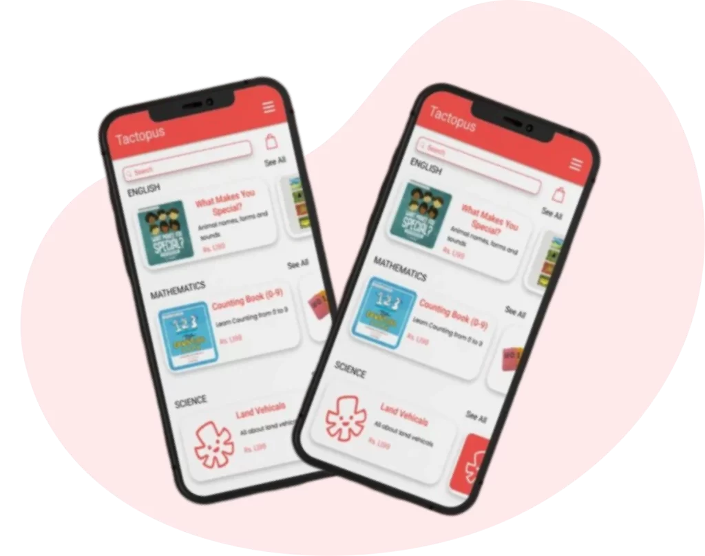
The arrangement of tiles for the products isn’t classified in a proper way which makes it confusing for novice users.
The parents with no products installed the audio augmentation despite the product wasn’t available to them.
Competitive Analysis
To get a better understanding of the competitor landscape, I conducted analyses with an app called LearnNext developed by a company named Next Education. This app provides a solution for underprivileged children to self-learn and is interactive with animated videos and various interactive interfaces. Hence the flow was different yet similar in a lot of ways. The basic flow of the app stays the same but the LearnNext app has more classified information than that of the Tactopus. Also, LearnNext doesn’t provide the factor to change the preferred language.
Understanding The Problems
To analyze the app from a theoretical manner, I then decided to do the heuristic evaluation as my next step. The heuristics are as follows:-
Transparency of System Structure - ‘‘The Tactopus Library’’ lets the user know where he/she is. - The transparency could be made better by associating a point of action when the user clicks on the ‘’Start Reading/Download’’ button. Eg: Making a sound once the button is clicked or showing the status of the download.
Universal experiences - Ambitious words could be used instead of “Start Reading” to make the app more user-friendly. Example:- “Study Now”.
User control and Freedom - The “Sign Out” option does not give the user the freedom to undo the accidental action.
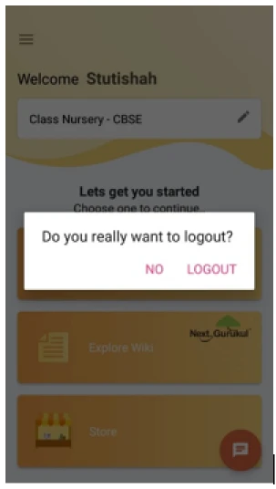
Like the above image from the LearnNext app, a dialogue box that gives freedom to undo the action of signing out.
Consistency and Standards -Consistency and Standards are followed. The “Read” button is red across the app on every page and that follows the consistency and standards of the app.
Error Prevention - The text under “Learning Objective” and “Book Description” isn’t very readable and can be missed/ignored by many users. We can mitigate it by making the description more visual. n every page and that follows the consistency and standards of the app.
Recognition rather than recall - The “Log in with Phone” suggests options to the user and that is a great way for the user to recognize what needs to be done. The details on the “Sign up” page should be suggesting options to the users based on what to type. Eg: State, Country, etc.
Like the above image from the LearnNext app, a dialogue box that gives freedom to undo the action of signing out.
Consistency and Standards -Consistency and Standards are followed. The “Read” button is red across the app on every page and that follows the consistency and standards of the app.
Flexibility and Efficiency of use -The current app can be used for a seasoned/advanced user but a first-time user should never be abandoned in confusion and should have a simple understanding of the app that suits their needs. The app has no flexible interface for a novice and an advanced user.
Minimal and Aesthetic Design -The information present throughout the app is minimal, necessary, and useful.
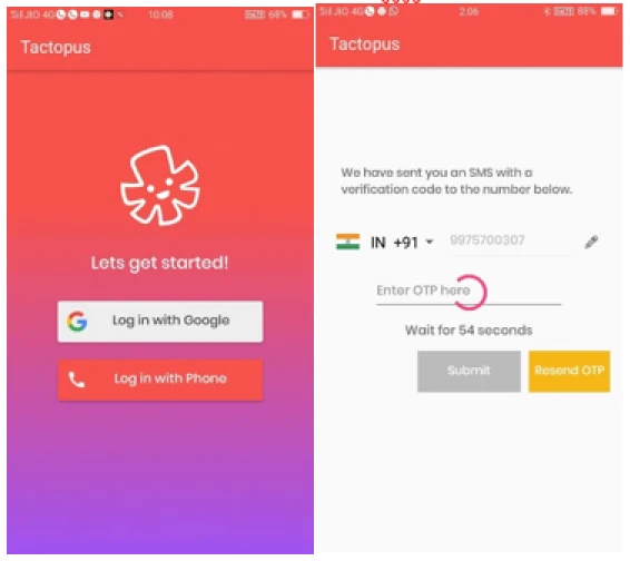
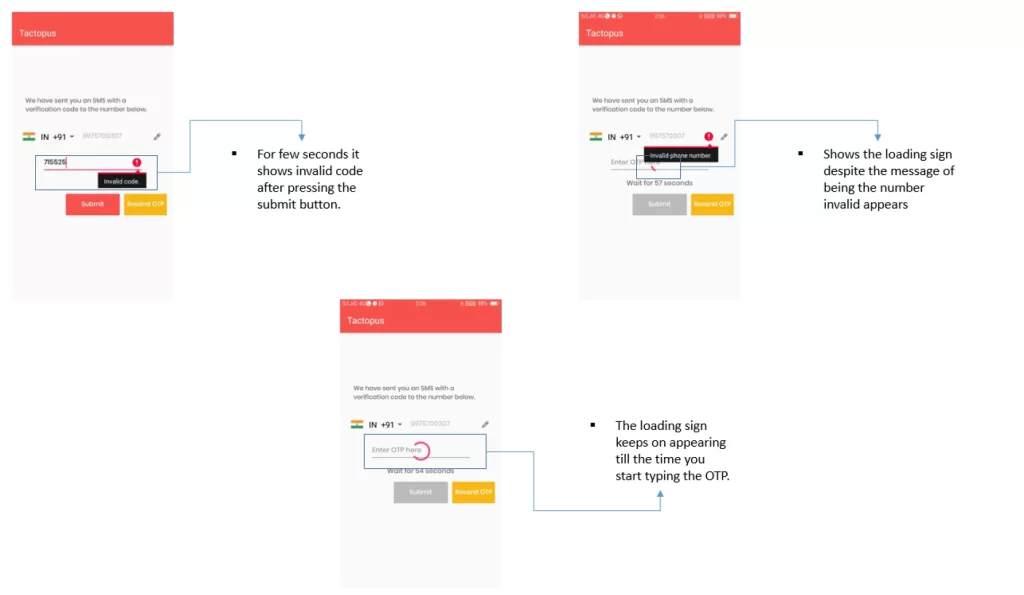
Recognize, diagnose, and recover -A wrong phone number could be entered on the login page but the loading screen appears anyway even though the error icon is displayed and that can be hard for the user to recover from.
Function Over Form -Visual cues can be used to direct a user in the app’s functionality. The app is filled with texts and no icons to indicate any references.
Help and Documentation -If there is any user who could not navigate through the app, adequate help should be provided within the product . The app would need a Help page for users in the long run as the number of products on the app would increase, a Help page can be useful.d with texts and no icons to indicate any references.
Accountable For
After collecting the information and insights, I jumped onto brainstorming ideas about what changes had to be implemented according to the needs mentioned by the company and the insights obtained through the research.
Suggested Changes
-To make the read button fit the width.
-To reconsider the names of the buttons.
-To visualize the product description.
-Shopping of the products
-Library to stack up all the products bought and used frequently by the users.
-To give an option to set the preferred language right after the login process as well as through the settings.
-To rearrange the products
-To reconsider the interactions.
-To provide a little tutorial after sign up process
-To ask for more info while signing up (country, state).
-To add a help page containing FAQs, contact us, terms, and policy options.
Information Architecture
Next in line, I created an Information Architecture for better information access. It also helped me focus on how the information will flow across the application.
Task Flow
Finally, I created a task flow of the whole order end to end. This gave me a clear picture of the steps that the users would take right from buying a product to using it on regular basis in the most effective manner possible
Iterate
The next step was to start iterating the designs based on information architecture and task flow created. The prototypes created have to be then tested to refine the design and make it more friendly.
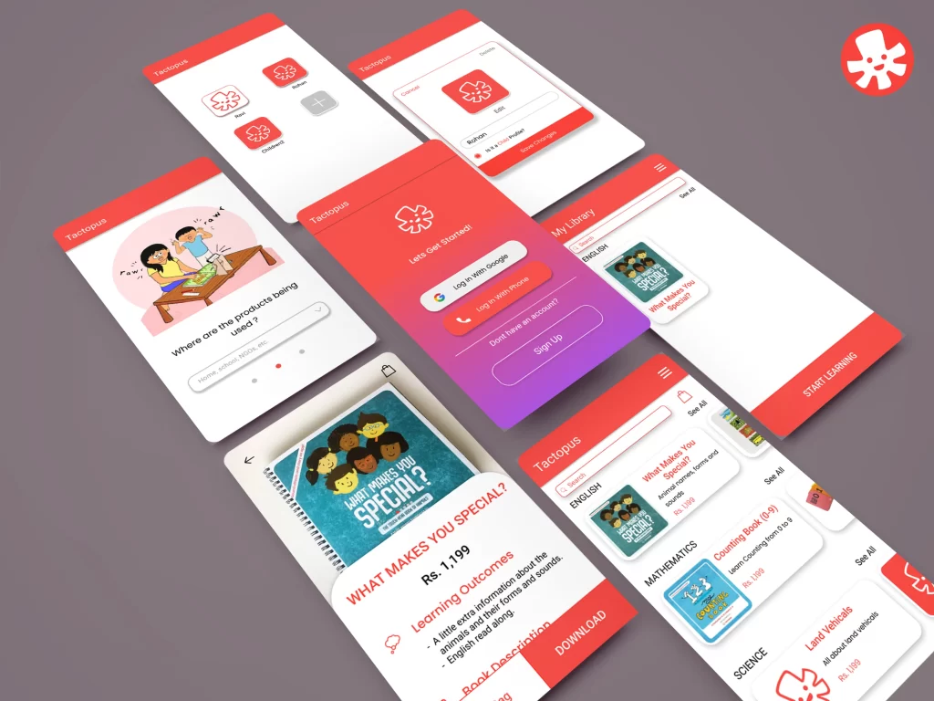
Low Fidelity Prototypes
Since ease of use is one of the biggest aims, the number of screens was kept to a minimum and I wanted to focus on covering the core features into making it a wholesome app. I started with pen and paper wireframes and created multiple versions of each screen until I found a combination of features and elements that I thought matched the users’ needs and that would be as intuitive as much as possible.
Test
The prototypes created had to be tested in order to know where the designs created went wrong. It was important to do a test of the prototypes to gain more insights into the user behavior over the new design to make it more friendly.
Usability Testing
With the pen and paper prototypes, I conducted a think aloud test with 2 users and found out that some key insights:-
-The registration process got the users overwhelmed with the amount of information asked for them to fill.
-The flow created got complex for kids.
High Fidelity Prototypes
After many tests, feedbacks, and iterations, my final product aligned with all of the objectives I had set in place - it includes the three core features necessary to make the app-friendly and easy to use.